Being cooped up at home for the majority of the year can really change the way we view our surroundings. Maybe you’re sick of your four walls or perhaps you wanna just change the decor but are lacking the inspiration. Here’s an idea: Look to the movies for colour inspiration!
Related Article: How to Make Your Kitchen More Eco Friendly
If you have been yearning to spruce up your living space for the past couple of months, you might just find the next huge inspiration here. Having the entirety of the circuit breaker in quarantine, I know one thing us Singaporeans have done is binge on a rather unhealthy amount of films and dramas. Whether you’re into cult classics or more of a modern musical fiend, the shows run the gamut from Wes Anderson’s The Grand Budapest Hotel to Damien Chazelle’s La La Land. Each equipped with their own interesting colour palettes, there are plenty of inspiration from these movies to draw from for your next home makeover. Read on to find out some of our favourites!
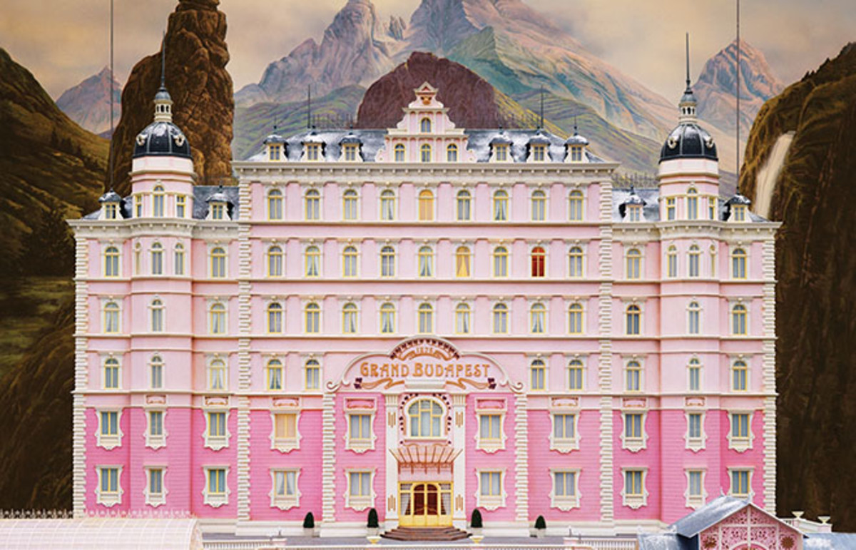
1. The Grand Budapest Hotel

We know that the works of the acclaimed director Wes Anderson are most known for their distinct colouration. Ask any film geek (or film geek wannabe) what they love about Anderson’s films and more often than not, you’ll get “the colour palettes, duh”. Often hazy and always pastel-like, this 2014 comedy features the signature muted pink, dusty purple, greyish blue, daffodil yellow, and more across the different time periods. Taking this into consideration, it would make sense to anchor the colour of your wall against an assortment of furniture within the same colour variant.
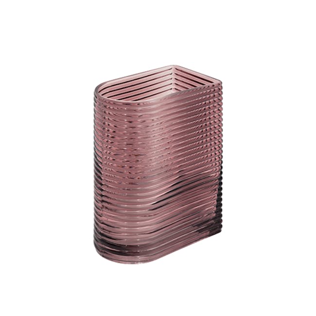
One immediate colour you can take at a glance from the movie would be its trademark pink. We’re not talking bright pink or fuchsia or even salmon pink. This dusty pink is subtle but not quiet, it has the ability to command a room if you properly match your furniture. To really elevate that quirky look, add touches of brass or brushed gold. We love these chic pieces from HipVan!


2. Star Wars: The Force Awakens

The 2015 Sci-Fi film features Harrison Ford, Adam Driver, John Boyega, Lupita Nyong’o and Daisy Ridley. One setting in particular that really caught my eye was the dusty planet of Tattoine. Here, we see an expansive dessert which easily calls to mind neutral and earthy tones. The colour palette in the image is simple to say the least, but it certainly can set the mood for something particular.
Beigey nudes and sandy brown wall colours would match furniture that are of a darker shade – think dark brown and even black. Instead of following your gut instinct to slap something white in there, opt for a contrast with a splash of grey here and there. This slate grey clock from HipVan works really well with the aesthetic with its plain and minimalist face.

-Ryder-Extendable-Dining-Table-1-5m--Dust-Brown-Lacquered-Oak--8-17.png?fm=jpg&auto=format%2Ccompress&cs=srgb&fit=fill&bg=ffffff&ixlib=react-9.0.2&w=650&h=650)


3. La La Land

The colours in La La Land are as romantic as the relationships on screen. At times, we are drenched in the deep, rich blues of the evening, and others we are tickled by the magic-hour skies that turn pink then purple. Amidst this all, we also get punctures of bright yellow and red. Emulate the same kind of aesthetic by being dramatic and romantic in your colour choices. Pick bold but loving colours with a touch of flair to them. Purples and mauve are usually great selections, as well as midnight blue.


Like Mia’s iconic yellow dress, don’t be afraid to embrace your own whimsy and drop in bold pops of colour. We love this burnt orange chair!

4. The Mamma Mia Franchise

Speaking of musicals, here’s one that’s bound to pander to all my Greece Aesthetic, Campari by the beach, seas and shells loving souls. Obviously there are going to be a lot of sea foam, sea green and sandy creams in this colour palette. Here are some gorgeous pieces from that colour palette.


However, it may be easy to overdo it and have your home end up looking more sandy, washed out sea resort than Lilly James / Meryl Streep chic. Add in some signature orange or dark teal colours to ground your overall palette and give it more of a character!

5. Blade Runner

Blade Runner is a 1982 science fiction film starring Harrison Ford, Rutger Hauer, Sean Young and Edward James Olmo. The film is set in a dystopian future Los Angeles of 2019 (yeah, that’s how OG this film is!) and you would expect a dystopian film to serve cold, hard and steel colours. However, Blade Runner comes through with anything but! You can expect a lot of cool tones – think light aquamarine- tinged with romantic purples and pinks, colours that are often associated with extravagance and innocence. For this colour palette, work with accents that can help elevate the overall look.


It is often so much easier than we think to get inspired and we do not have to go to the museums or rent out so decoration books – just turn on Netflix! If you want to invest in these items but are not willing to cough all the money upfront, try hoolah! Our buy now and pay later scheme will ensure you get the cutest items for your home makeover at a payment plan that best suits you.


